In literature, Leica products are presented attractively and with an expression of perceived premium value. The premium aspect of Leica is reflected throughout in the esthetics of the layout and design: from exclusive finishes such as UV lacquer, to emotive images and copy and the generous use of white space. The following pages provide detailed instructions and specifications for all characteristics of the layout construction, the use of the layout grid, images, typography, text entities, tables, and special aspects. Two aspects of the layout and design are particularly noteworthy: firstly, that the page layout in literature always begins from the lower page edge and, secondly, that the layout is extremely flexible thanks to the use of the classical column grid.
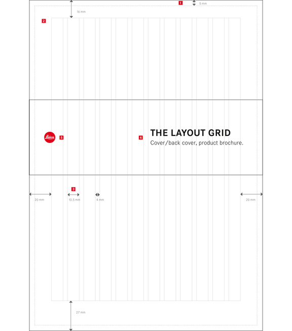
The Layout Grid


Cover/back cover, product brochure.
Frame
Width: 5 mm
Colour fill
Position: x = 5 mm, y = 5 mm, W × H = 20 × 297 mm, colour: black 40/0/0/100
Type space
Columns: 12, gutter: 4 mm, margins: left: 20 mm, right: 20 mm, bottom: 27 mm, top: 16 mm
Banderole
Position: x = 0 mm, y = 89.5 mm, W × H: 210 × 67.5 mm; the banderole always extends across the full format width; special finish: UV lacquer
Logo
Position: x = 13.5 mm, y = 118.25 mm; the logo is set vertically centered on the banderole; size: ø 10 mm


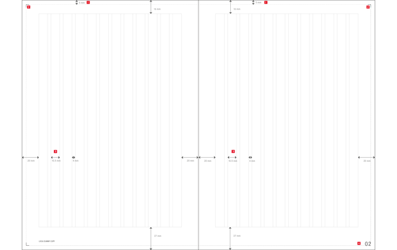
Layout grid, inside pages.
Frame
Width: 5 mm
Corners
Length: 3.5 mm, line thickness: 0.3 pt, position: inner frame edges
Type space
Columns: 12, gutter: 4 mm, margins: left: 20 mm, right: 20 mm, bottom: 27 mm, top: 16 mm
Typography Within The Layout Grid
In addition to the various types of images used in literature, there are also different types of text entities: each text entity is governed by its own particular design guidelines. For instance, it is immediately recognizable whether a piece of copy is informative or emotive, whether it describes a camera feature, or tells the story presented in the brochure. The following page shows and describes all types of text entities. The table below serves as a reference and provides an overview of the most important typographic parameters.
TEXT ENTITY
CORPORATE S BQ
SIZE
LINE SPACING
TRACKING
COLOUR
COVERS/
BACK COVERS
HEADLINE
bold, caps
28 pt
- - -
15
white
SUBHEADING
light
14 pt
29.6 pt
15
white
ORIGINATOR
regular
8 pt
12 pt
15
white
CHAPTER
SEPARATORS
HEADLINE
light, bold, caps
26.5 pt
30 pt
15
white
INSIDE PAGES
HEADLINE
light, bold, caps
19 pt
- - -
15
black/red
SUBHEADING
light
12 pt
18 pt
15
black
EDITORIAL
light
10 pt
14 pt
15
black
CHAPTER INTRO
light
10 pt
14 pt
15
black
PRODUCT INTRO
light
10 pt
14 pt
15
black
PRODUCT TEXT
light
8 pt
11 pt
15
black
KEY WORDS
light, caps
8 pt
11 pt
20
black
PRODUCT
CHARACTERISTICS
light
8 pt
11 pt
15
black
NUMBERS
medium
8 pt
11 pt
15
black
FEATURE LINES
medium
6 pt
- - -
15
black
CAPTIONS
light
6 pt
8 pt
15
black
PAGE NUMBERS
light
19 pt
- - -
20
black
IMPRINT
light
8 pt
11 pt
15
black
LIST OF CONTENT
(HLs) light, caps
(SLs) light
10 pt
8 pt
14 pt
14 pt
15
15
black
black
TABLES
COLUMN HEADERS
medium
7.5 pt
9 pt
15
black
CONTENT LINES
light
7.5 pt
9 pt
15
black
SEPARATING LINES
TYPE SIZE
TYPEFACE
SCALING
BASELINE SHIFT
6 pt
Corporate S BQ
125%
–0.55 pt
7 pt
Corporate S BQ
125%
–0.65 pt
8 pt
Corporate S BQ
125%
–0.75 pt
9 pt
Corporate S BQ
125%
–0.85 pt
10 pt
Corporate S BQ
125%
–0.9 pt
11 pt
Corporate S BQ
125%
–1.0 pt
12 pt
Corporate S BQ
125%
–1.05 pt
13 pt
Corporate S BQ
125%
–1.2 pt
14 pt
Corporate S BQ
125%
–1.25 pt
15 pt
Corporate S BQ
125%
–1.35 pt
16 pt
Corporate S BQ
125%
–1.45 pt
17 pt
Corporate S BQ
125%
–1.55 pt
18 pt
Corporate S BQ
125%
–1.65 pt