This chapter defines the layout and design of advertisements. The following principles and rules illustrate and explain the typical layout of Leica advertisements. All advertisement formats are shown in detail. A general overview of the formats and the essential dimensions makes it easier to define basic layouts and serves as a quality assurance tool. Master files for all formats for all cameras are available for download.
General Principles
This page deals with the general principles of the design and layout of advertisements. It describes all important basic rules and individual components, communicating a fundamental understanding for the layout and design. These rules also allow the production of advertisement formats consistent with the rules, but in formats not defined in this chapter.

1/1 ad
(210 × 297 mm)

1/3 ad
(100 × 297 mm)

1/2 ad
(210 × 148 mm)

Dealer ad
(90 × 100 mm)
Layouts for advertisements are all derived from a standardized basic layout. The following
pages present an overview of the individual elements and components of the layout and
design.
Advertisements are always produced in 4C (CMYK).
Four different advertisement formats are employed: 1/1 ads, 1/2 ads, 1/3 ads, and dealer ads. The table below lists the most important dimensions for the construction of layouts for each of these formats. Detailed information on the use of individual layout elements is shown in the sections describing the respective advertisement formats.
All dimensions stated also serve as guidelines for advertisements in similar formats. When preparing layouts for formats other than those defined, please use the digital template closest to the format required.
In the case of 1/1 ads (210 × 297 mm), the logo size is different from the sizes defined for DIN formats (please also refer to chapter “Design Principles – Logo”).
Base Layout
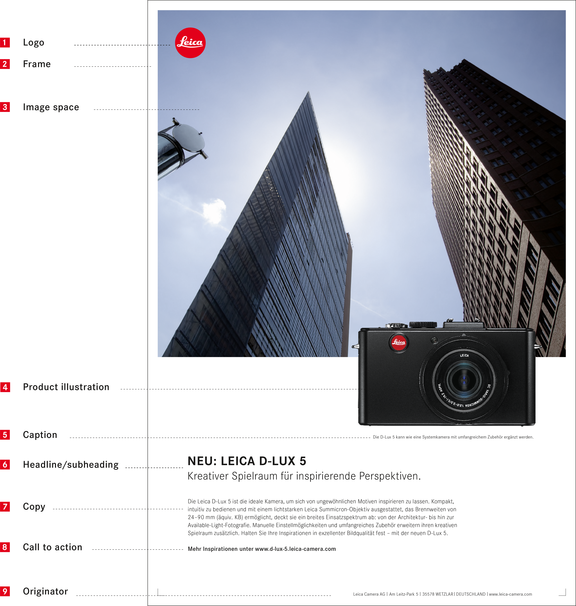
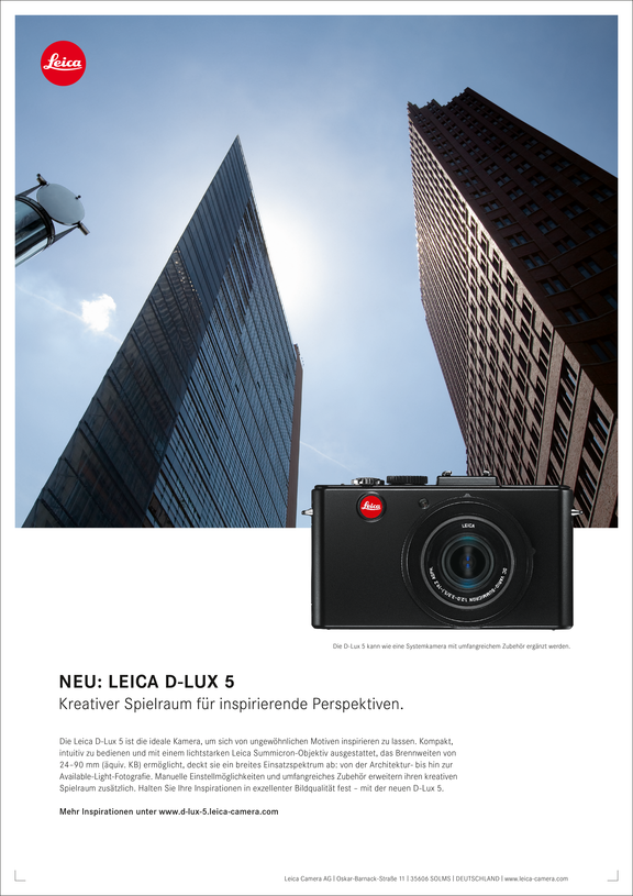
The advertisement layout is defined by a clear horizontal bisection: an image is placed in the upper format segment, with an isolated product illustration below it that bleeds into the image. The format is concluded with a generously proportioned white space containing the headline, subheading, copy, call to action, and the originator.
Logo
The standard version of the logo is employed in all advertisement formats (Leica Camera Red). The logo size and its precise location in the top-left corner are specified for each format. In 1/1 and 1/3 ads, the logo size is different from that defined in the rules. Instead of the 10 mm size specified for DIN A4 (refer to chapter “Basic elements – Logo,” page 05), the logo is employed with a diameter of 15 mm for these two formats to enhance the prominence of Leica as the originator. As the logo in advertisements is always superimposed on an image, care must be taken to ensure its prominence: the background at its location must not be too distracting.
Frame
The white frame is a particular characteristic of all Leica advertising media. In places where it borders on a white space, i.e. it would be invisible, it is defined by framing corners (refer to chapter “Design elements – Framing corners”). The line thickness of framing corners varies in proportion to the format (refer to chapter “Design elements – Frame”).
Image space as strictly defined element
The size and position of the image space is specified for all advertisement formats and should not be modified. The image space and the camera position are the two strictly defined elements in advertisements. The text content develops from the bottom upwards. The amount of copy may be varied to ensure flexibility in handling advertisement content. The consequence of this is that the headline and copy block are not always located at the same height in advertisements with identical formats. The copy length is then compensated by the number of lines and columns of text. This means that longer passages of copy extend over more lines and columns than shorter passages.
Product illustration
The display size and the respective bleed of the image space are specified for each product and advertisement format. The specified bleed of the image space must also be maintained in nonstandard formats or other applications.
Caption
The caption is always set right-aligned and below the product illustration. The spacing between the text line and the product is specified for all advertisement formats.
Headline /
subheading
The headline and subheading are always positioned left-aligned within the type space. In typographical terms, all ads develop upwards from the bottom edge of the type space. The consequence of this is that the y-position of the headline and subheading varies depending on the length of the copy. The maximum length of copy is specified to ensure that a minimum spacing between the headline and image is maintained at all times. The subheading is separated from the copy by two blank lines (same size as copy lines). The font sizes for headlines and subheadings are strictly specified for the respective formats. The following rule applies: subheading font size = headline font size –2 pt (1/1 and 1/3 ads: 17 pt/15 pt, 1/2 ad: 13 pt/11 pt, dealer ad: 10 pt/8 pt). The defined ad templates should be employed as guidelines for nonstandard formats. The line spacing between the headline and the subheading and between the lines of multiline subheadings is identical. It is strictly defined for the standard advertisement formats.
Copy
The copy is always positioned left-aligned within the type space . Care must be taken to ensure that the typography of all ads develops upwards from the bottom edge of the type space. The width of the copy block is variable and is dependent on the amount of text. The maximum and minimum lengths of text lines are strictly defined for each advertisement format. The blank lines specified as separators between copy and subheading, and between copy and call to action, determine the visual structure of the text and must be maintained at all times. Special rules apply for font sizes, font styles, tracking, line spacing, and colours.
Call to action
The call to action motivates readers to respond, and is the closing element of every advertisement. In graphic terms, the call to action is separated from the copy by a blank line and is highlighted by the use of medium font style.
Originator
The originator is always set right-aligned in the specified sequence on the bottom edge of the frame. Leica Camera AG I Am Leitz-Park 5 I 35578 WETZLAR I GERMANY I www.leica-camera.com
Layout Grid
1/1 ad
1/3 ad
1/2 ad
Dealer ad
NUMBER OF COLUMNS
12
4
12
4
GUTTER WIDTH
4 mm
4 mm
4 mm
4 mm
LEFT MARGIN
20 mm
8 mm
12 mm
6 mm
RIGHT MARGIN
20 mm
12 mm
12 mm
6 mm
BOTTOM MARGIN
27 mm
27 mm
16.4 mm
7 mm
TOP MARGIN
5 mm
5 mm
3.5 mm
3.5 mm
Layout
1/1 ad
1/3 ad
1/2 ad
Dealer ad
LOGO SIZE
15 mm
15 mm
10 mm
10 mm
LOGO POSITION*
x = 13.5 mm
y = 13.5 mm
x = 13.5 mm
y = 13.5 mm
x = 9.45 mm
y = 9.45 mm
x = 5.95 mm
y = 5.95 mm
FRAME WIDTH
5.0 mm
5.0 mm
3.5 mm
3.5 mm
IMAGE SPACE (W x H)
200 × 170 mm
90 × 136 mm
203 × 77 mm
83 × 46.5 mm
CORNERS (LENGTH;
LINE THICKNESS)
3.5 mm; 0.3 pt
3.5 mm; 0.3 pt
2 mm; 0.3 pt
2 mm; 0.3 pt
BOTTOM EDGE, CAMERA
X-System
y = 202 mm
y = 161 mm
y = 102.5 mm
y = 63.2 mm
M-System
y = 209 mm
y = 166 mm
y = 107.5 mm
y = 63.8 mm
Compacts
y = 209 mm
y = 166 mm
y = 107.5 mmº
y = 63.8 mm
* As a rule, the logo position is determined from the frame width multiplied by the factor 2.7
(logo position = 2.7 × frame width). Exception: As the frame width may not be less than 3.5 mm,
even in smaller formats, the factor is reduced to 1.7 for such cases (for instance, in dealer ads).
º Exception: V-Lux 2: y = 104.5 mm
Typography
1/1 ad
1/3 ad
1/2 ad
Dealer ad
HEADLINE
17 pt
17 pt
13 pt
10 pt
SUBHEADING
15 pt/20 pt LS
15 pt/20 pt LS
11 pt/16 pt LS
8 pt/12 pt LS
COPY
8 pt/11 pt LS
8 pt/11 pt LS
8 pt/11 pt LS
-
CAPTIONS
6 pt/9 pt LS
6 pt/9 pt LS
6 pt/9 pt LS
-
CALL TO ACTION
8 pt/11 pt LS
8 pt/11 pt LS
8 pt/11 pt LS
7 pt/9 pt LS
ORIGINATOR
6 pt/9 pt LS
6 pt/9 pt LS
6 pt/9 pt LS
6 pt/8 pt LS
LS: line spacing
1/1 advertisements
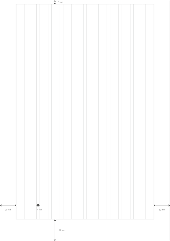
COLUMNS
12
GUTTER WIDTH
4 mm
LEFT MARGIN
20 mm
RIGHT MARGIN
20 mm
BOTTOM MARGIN
27 mm
TOP MARGIN
5 mm
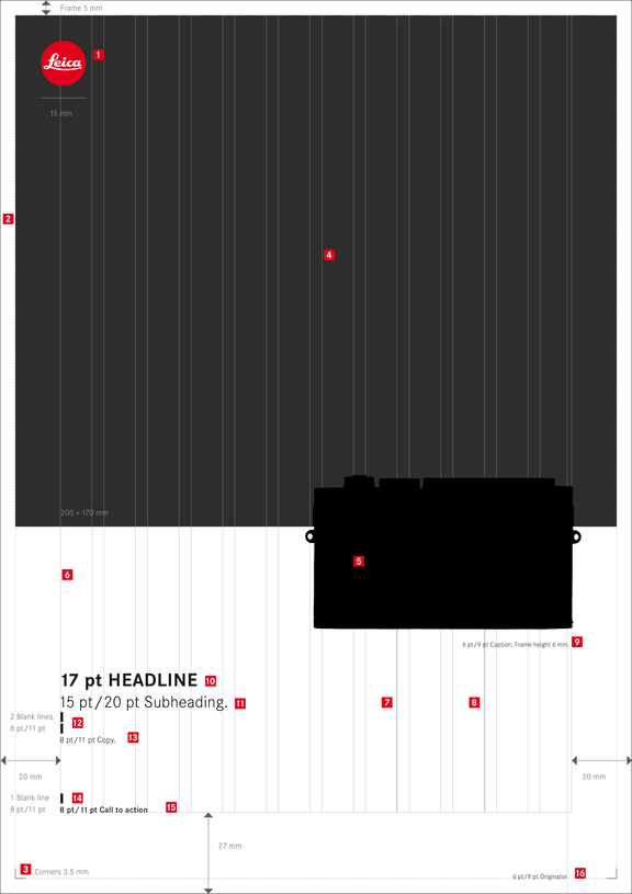

Advertisements in 210 × 297 mm format.
Logo
Position: x = 13.5 mm, y = 13.5 mm (2.7 × frame width), size: ø 15 mm
Frame
Width: 5 mm
Corners
Length: 3.5 mm, line thickness 0.3 pt, position: inner frame edges
Image space
W × H: 200 × 170 mm
Product illustration
The product is always shown in a full-frontal view and without accessories. Position: right-aligned in the type space (visually) , defined size, and specified bleed into the image space. The comparative dimensions of the individual cameras are shown on the following double page.
Type space
Columns: 12, gutter: 4 mm, margins: left: 20 mm, right: 20 mm, bottom: 27 mm, top: 5 mm
Minimum text width
8 columns
Maximum text width
10 columns
Caption
Position: right-aligned in the type space, space between text line and product illustration: 6 mm, font: Corporate S BQ light, font size: 6 pt, line spacing: 9 pt, tracking: 15, colour: black
Headline
Position: left-aligned in the type space, length: 1 line, maximum of 8 columns, font: Corporate S BQ bold, caps, font size: 17 pt, tracking: 15, colour: black
Subheading
Position: left-aligned in the type space, length: 1 line, maximum of 10 columns, the length of the subheading should not exceed the line length of the copy block, font: Corporate S BQ light, font size: 15 pt, line spacing from headline: 20 pt, tracking: 15, colour: black
Space
2 blank lines in 8 pt/11 pt LS between subheading and copy
Copy
Position: left-aligned in the type space, develops from the bottom upwards, length: 4–6 lines over a minimum of 8 and a maximum of 10 columns, font: Corporate S BQ light, font size: 8 pt, line spacing: 11 pt, tracking: 15, colour: black
Space
1 blank line in 8 pt/11 pt LS between copy and call to action
Call to action
Position: left-aligned in the type space, develops from the bottom upwards, font: Corporate S BQ medium, font size: 8 pt, line spacing: 11 pt, tracking: 15, colour: black
Originator
Position: at the bottom of the frame, right-aligned in the type space, font: Corporate S BQ light, font size: 6 pt, line spacing: 9 pt, tracking: 15, colour: black
Separating line
Capital “i,” font: Corporate S BQ light, font size: 6 pt, vertically scaled (125%), baseline shift –0.55 pt, 1 space before and after the line (refer to table and usage to chapter “Brochures-Typography”)
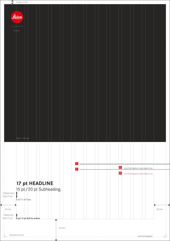

Comparison of advertisements in 210 × 297 mm format.
Product illustration
Position: right-aligned in the type space, the size and bleed into the image space are specified for each camera.

Bottom edge, X-System: y = 202 mm

Bottom edge, M-System: y = 209 mm

Bottom edge, compacts: y = 209 mm
Caption
Position: right-aligned in the type space, space between text line and the bottom edge of the respective product illustration: 6 mm
1/3 advertisements
COLUMNS
4
GUTTER WIDTH
4 mm
LEFT MARGIN
8 mm
RIGHT MARGIN
12 mm
BOTTOM MARGIN
27 mm
TOP MARGIN
5 mm
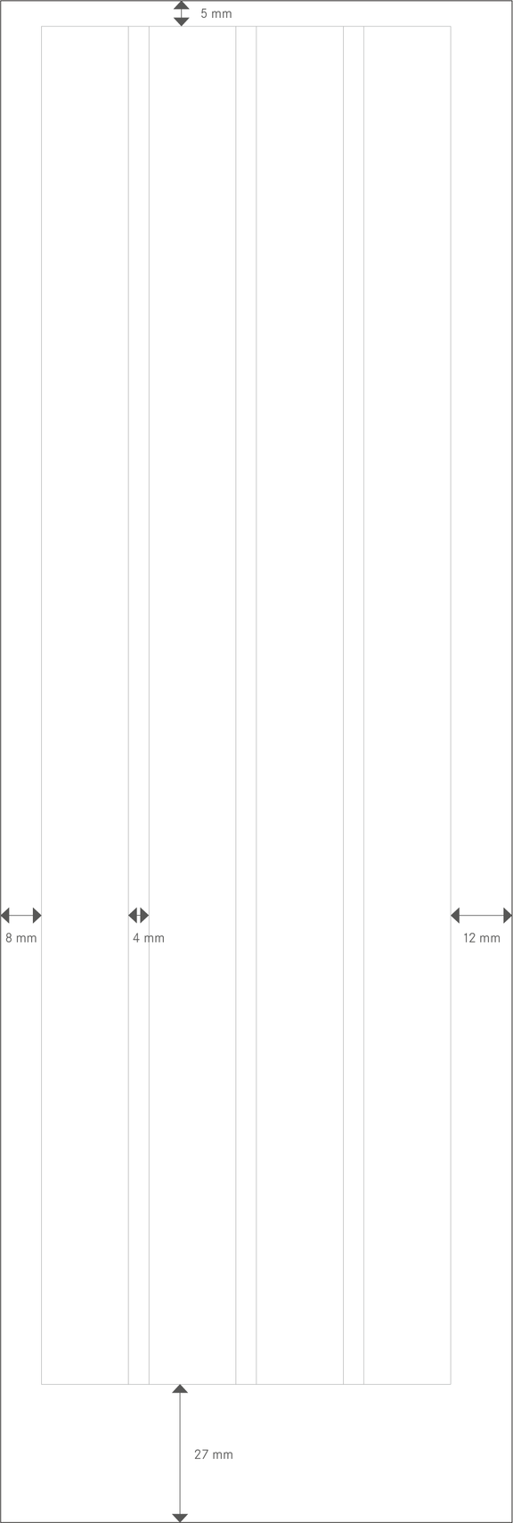
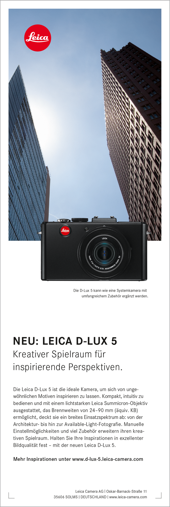
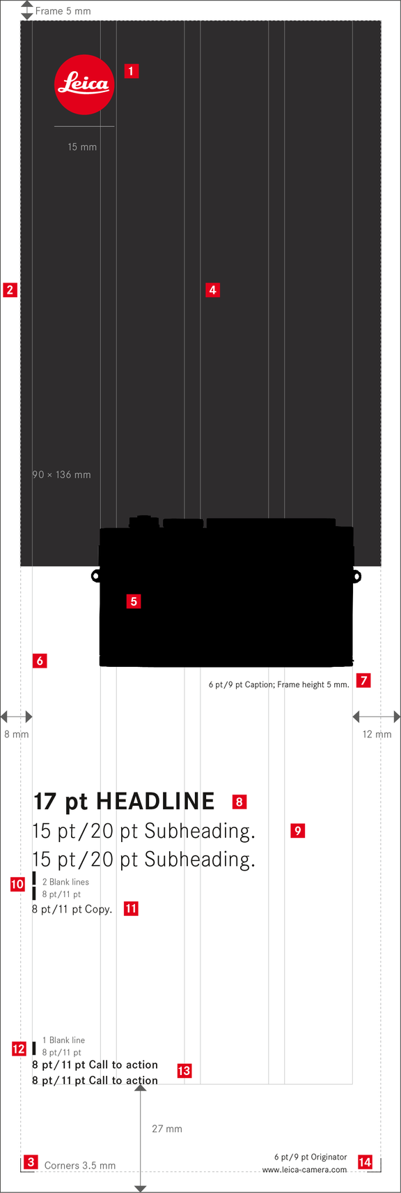

Advertisements in 100 × 297 mm format.
Logo
Position: x = 13.5 mm, y = 13.5 mm (2.7 × frame width), size: ø 15 mm
Frame
Width: 5 mm
Corners
Length: 3.5 mm, line thickness 0.3 pt, position: inner frame edges
Image space
W × H: 90 × 136 mm
Product illustration
The product is always shown in a full-frontal view and without accessories. Position: right-aligned in the type space (visually) , defined size, and specified bleed into the image space. The comparative dimensions of the individual cameras are shown on the following double page.
Type space
Columns: 4, gutter: 4 mm, margins: left: 8 mm, right: 12 mm, bottom: 27 mm, top: 5 mm
Caption
Position: right-aligned in the type space, space between text line and product illustration: 5 mm, font: Corporate S BQ light, font size: 6 pt, line spacing: 9 pt, tracking: 15, colour: black
Headline
Position: left-aligned in the type space, 1 line, font: Corporate S BQ bold, caps, font size: 17 pt, tracking: 15, colour: black
Subheading
Position: left-aligned in the type space, 1 to 2 lines, font: Corporate S BQ light, font size: 15 pt, line spacing: 20 pt, line spacing from headline: 20 pt, tracking: 15, colour: black
Space
2 blank lines in 8 pt/11 pt LS between subheading and copy
Copy
Position: left-aligned in the type space, develops from the bottom upwards, 8–11 lines, across 4 columns, font: Corporate S BQ light, font size: 8 pt, line spacing: 11 pt, tracking: 15, colour: black
Space
1 blank line in 8 pt/11 pt LS between copy and call to action
Call to action
Position: left-aligned in the type space, develops from the bottom upwards, font: Corporate S BQ medium, font size: 8 pt, line spacing: 11 pt, tracking: 15, colour: black
Originator
Position: at the bottom of the frame, right-aligned in the type space, 2 lines, font:
Corporate S BQ light, font size: 6 pt, line spacing: 9 pt, tracking: 15, colour: black
Separating line
Capital “i,” font: Corporate S BQ light, font size: 6 pt, vertically scaled (125%), baseline shift –0.55 pt, 1 space before and after the line (refer to table and usage to chapter “Brochures-Typography”)
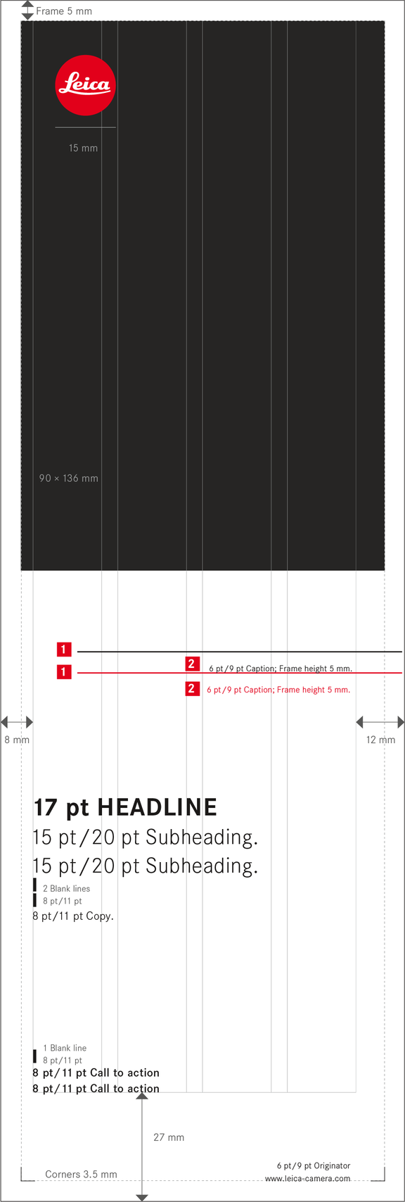

Comparison of advertisements in 100 × 297 mm format.
Product illustration
Position: right-aligned in the type space, the size and bleed into the image space are specified for each camera.

Bottom edge, X-System: y = 161 mm

Bottom edge, M-System: y = 166 mm

Bottom edge, compacts: y = 166 mm
Caption
Position: right-aligned in the type space, space between text line and the bottom edge of the respective product illustration: 5 mm
1/2 advertisements
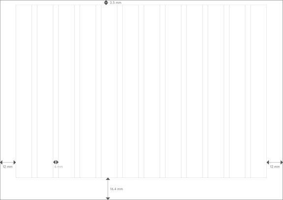
COLUMNS
12
GUTTER WIDTH
4 mm
LEFT MARGIN
12 mm
RIGHT MARGIN
12 mm
BOTTOM MARGIN
16.4 mm
TOP MARGIN
3.5 mm
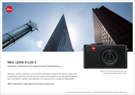

Advertisements in 210 × 148 mm format.
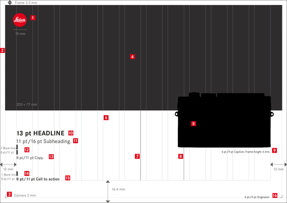
Logo
Position: x = 9.45 mm, y = 9.45 mm (2.7 × frame width), size: ø 10 mm
Frame
Width: 3.5 mm
Corners
Length: 2 mm, line thickness: 0.3 pt, position: inner frame edges
Image space
W × H: 203 × 77 mm
Product illustration
The product is always shown in a full-frontal view and without accessories. Position: right-aligned in the type space (visually) , defined size, and specified bleed into the image space. The comparative dimensions of the individual cameras are shown on the following double page.
Type space
Columns: 12, gutter: 4 mm, margins: left: 12 mm, right: 12 mm, bottom: 16.4 mm, top: 3.5 mm
Minimum text width
6 columns
Maximum text width
8 columns
Caption
Position: right-aligned in the type space, space between text line and product illustration: 4 mm, font: Corporate S BQ light, font size: 6 pt, line spacing: 9 pt, tracking: 15, colour: black
Headline
Position: left-aligned in the type space, length: 1 line, maximum of 6 columns, font: Corporate S BQ bold, caps, font size: 13 pt, tracking: 15, colour: black
Subheading
Position: left-aligned in the type space, length: 1 line, maximum of 6 columns, the length of the subheading should not exceed the line length of the copy block, font: Corporate S BQ light, font size: 11 pt, line spacing from headline: 16 pt, tracking: 15, colour: black
Space
2 blank lines in 8 pt/11 pt LS between subheading and copy
Copy
Position: left-aligned in the type space, develops from the bottom upwards, length: 3 lines over a minimum of 6 and a maximum of 8 columns, font: Corporate S BQ light, font size: 8 pt, line spacing: 11 pt, tracking: 15, colour: black
Space
1 blank line in 8 pt/11 pt LS between copy and call to action
Call to action
Position: left-aligned in the type space, develops from the bottom upwards, font: Corporate S BQ medium, font size: 8 pt, line spacing: 11 pt, tracking: 15, colour: black
Originator
Position: at the bottom of the frame, right-aligned in the type space, font: Corporate S BQ light, font size: 6 pt, line spacing: 9 pt, tracking: 15, colour: black
Separating line
Capital “i,” font: Corporate S BQ light, font size: 6 pt, vertically scaled (125%), baseline shift –0.55 pt, 1 space before and after the line (refer to table and usage to chapter “Brochures-Typography”)
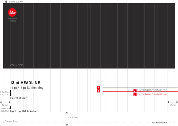

Comparison of advertisements in 210 × 148 mm format.
Product illustration
Position: right-aligned in the type space, the size and bleed into the image space are specified for each camera.

Bottom edge, X-System: y = 102.5 mm

Bottom edge, M-System: y = 107.5 mm

Bottom edge, compacts: y = 107.5 mm

(*Exception: V-Lux 2: y = 104.5 mm)
Caption
Position: right-aligned in the type space, space between text line and the bottom edge of the respective product illustration: 4 mm
Dealer advertisements
COLUMNS
4
GUTTER WIDTH
4 mm
LEFT MARGIN
6 mm
RIGHT MARGIN
6 mm
BOTTOM MARGIN
7 mm
TOP MARGIN
3.5 mm
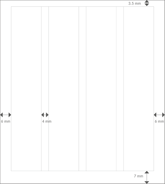
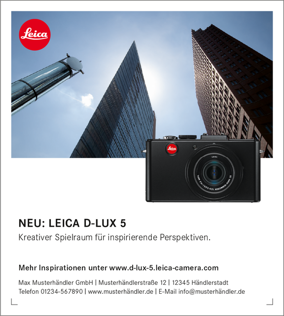
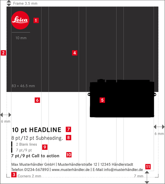

Advertisements in 90 × 100 mm format.
Logo
Position: x = 5.95 mm, y = 5.95 mm (1.7 × frame width), size: ø 10 mm
Frame
Width: 3.5 mm
Corners
Length: 2 mm, line thickness: 0.3 pt, position: inner frame edges
Image space
W × H: 83 × 46.5 mm
Product illustration
The product is always shown in a full-frontal view and without accessories. Position: right-aligned in the type space (visually) , defined size, and specified bleed into the image space. The comparative dimensions of the individual cameras are shown on the following double page.
Type space
Columns: 4, gutter: 4 mm, margins: left: 6 mm, right: 6 mm, bottom: 7 mm, top: 3.5 mm
Headline
Position: left-aligned in the type space, length: 1 line, maximum of 3 columns, font: Corporate S BQ bold, caps, font size: 10 pt, tracking: 15, colour: black
Subheading
Position: left-aligned in the type space, length: 1 line, maximum of 3 columns, font: Corporate S BQ light, font size: 8 pt, line spacing from headline: 12 pt, tracking: 15, colour: black
Space
2 blank lines in 7 pt/9 pt LS between subheading and call to action
Call to action
Position: left-aligned in the type space, develops from the bottom upwards, font: Corporate S BQ medium, font size: 7 pt, line spacing: 9 pt, tracking: 15, colour: black
Originator
Position: left-aligned at the bottom edge of the type space, font: Corporate S BQ light, font size: 6 pt, line spacing: 8 pt, tracking: 15, colour: black
Separating line
Capital “i,” font: Corporate S BQ light, font size: 6 pt, vertically scaled (125%), baseline shift –0.55 pt, 1 space before and after the line (refer to table and usage to chapter “Brochures-Typography”)
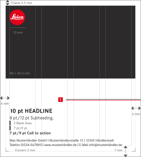

Comparison of advertisements in 90 × 100 mm format.
Product illustration
Position: right-aligned in the type space, the size and bleed into the image space are specified for each camera.

Bottom edge, X-System: y = 63.2 mm

Bottom edge, M-System: y = 63.8 mm

Bottom edge, compacts: y = 63.8 mm