General and construction
Sub-logos are a combination of the red Leica logo and a word mark with or without a location (e.g. Academy or Store Berlin)
They are always constructed in the same way. The combination of the red Leica logo and the word mark creates a single entity. The two components may never be scaled separately.
The minimum permissible diameter of the red Leica logo is 10 mm. A special version of the sub-logo with modified font size is available for very small formats (e.g. business cards).
Sub-logos may only be used in the specified form. They may not be appended or combined with other content.
Sub-logos are used primarily on business stationery (letterheads, business cards, and envelopes, etc.).


Download
Please note: Sub-logos displayed on business cards do not correspond to the layout specifications given here. Sub-logos for business cards can be found in the chapter Business Cards.
Construction

Leica Logo
Size: ø 30 mm, colour: Leica Camera Red (spot colour)
Designation
Font: Corporate S BQ bold, caps, font size: 39.9 pt, line spacing: 48 pt, tracking: 15, colour: black. Position: visually centered at a horizontal distance of 10 mm from the Leica logo
Distance between
logo and claim
The distance between the Leica logo and the text is equivalent to 1/3 of the logo diameter; at a logo diameter of 30 mm, this corresponds to: 10 mm

Leica Logo
Size: ø 30 mm, colour: Leica Camera Red (spot colour)
Designation
Font: Corporate S BQ bold, caps, font size: 39.9 pt, line spacing: 48 pt, tracking: 15, colour: black.
Location
Font: Corporate S BQ light, font size: 24.9 pt, line spacing 32.4 pt, tracking: 15, colour: black
Location/
logo intersection
The projection of the top edge of the first text line intersects the logo at a distance of 15.5% of its diameter (measured from above); at a logo diameter of 30 mm, this corresponds to: 4.65 mm. Maintaining the font size and line spacing specified for both text lines, this results in a lower logo intersection of 13% (measured from the bottom); at a logo diameter of 30 mm, this corresponds to: 3.9 mm
Distance between
logo and text
The distance between the Leica logo and the text is equivalent to 1/3 of the logo diameter; at a logo diameter of 30 mm, this corresponds to: 10 mm
The layout of a sub-logo with a Leica logo diameter of 30 mm is shown here. A branding element created in this way can be scaled proportionally.
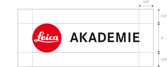
Freedom of Space

The free space around the sub-logo is always 1/2 H.
In case of very small formats, the free space can be reduced to 1/4 H.
H = height of the Leica dot.
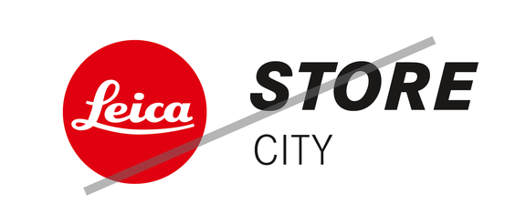
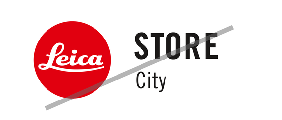
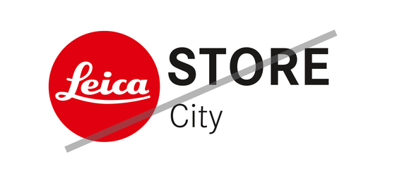
Dont's

Don't change font.

Don't change typeface.

Don't change spacing.