Templates
Leica Camera
Leica business cards are produced in the format 85 x 54 mm. Business cards for Leica Camera AG and its subsidiaries are available in two different versions: personalized, two-sided (monolingual) and personalized, two-sided (bilingual) for languages with non-Latin characters. In the case of bilingual business cards, all information is printed on one side. The back is used for the second language. Business cards are always two-sided.
Technical information can be found in the chapter "Print Production".
To obtain business card templates, please contact your subsidiary marketing manager. They will coordinate with the Leica Camera AG marketing team on your behalf.
VERSION 1
two-sided, personalized, monolingual
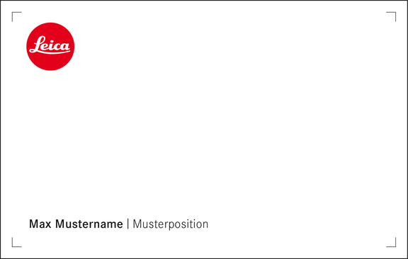
Front
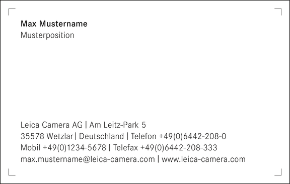
Back
VERSION 2
two-sided, personalized, bilingual
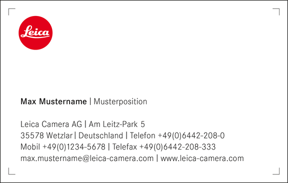
Front
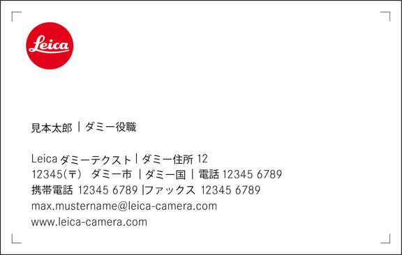
Back
Leica Camera AG and Subsidiary business card templates contain an alternative front side, to be used for long names or functions.
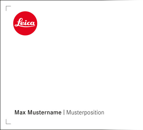
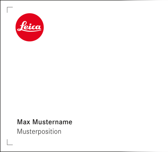
The examples displayed here show Leica Camera AG stationery; the descriptions apply equally to stationery for all Leica subsidiaries.
Sub-Logos
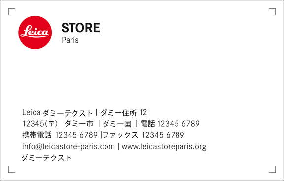
Leica business cards are produced in the format 85 x 54 mm. These are available in four versions: personalized, two-sided (monolingual), nonpersonalized, two-sided (monolingual) and, for languages with non-Latin characters, personalized, two-sided (bilingual) and nonpersonalized, two-sided (bilingual). In the case of bilingual business cards, all information is printed on one side. The back is used for the second language. Business cards are always two-sided.
VERSION 1
two-sided, personalized, monolingual
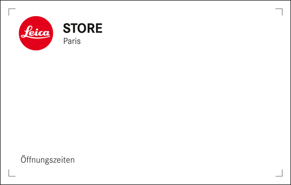
Front
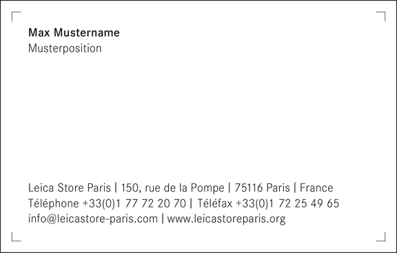
Back
VERSION 2
two-sided, nonpersonalized, monolingual

Front
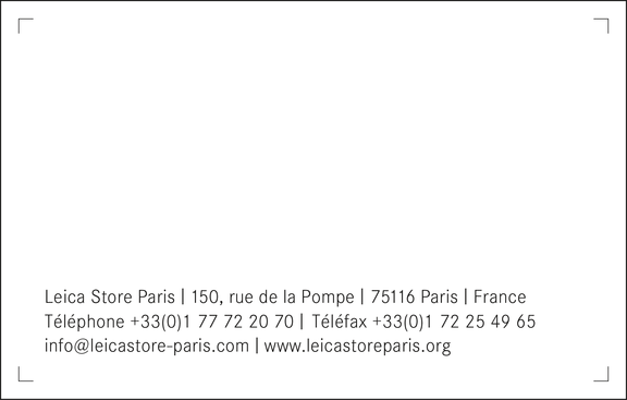
Back
VERSION 3
two-sided, personalized, bilingual
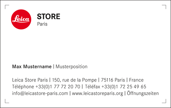
Front
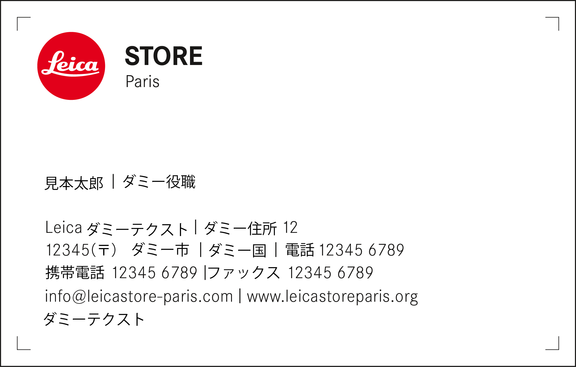
Back
VERSION 4
two-sided, nonpersonalized, bilingual
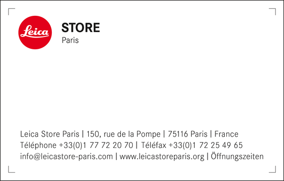
Front
Back
Please note: Sub-logos displayed on business cards do not correspond to the layout specifications in design principles. Sub-logos for business cards are packaged with the business card files. Open sub-logo layout files can be downloaded here:
The examples displayed here show Leica store stationery; Templates with all other sub‑logos are included in downloads.





Structure / Grid
Leica Camera
Layout of monolingual business cards (85 × 54 mm).
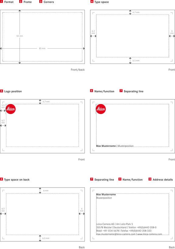

Format
W x H: 85 x 54 mm
Frame
Width: 2.5 mm
Corners
Length: 2 mm, line thickness: 0.2 pt, position: inner frame edges
Type space
Margin: left 6.2 mm, right: 6 mm, bottom: 6.5 mm, top 4.7 mm
Logo
Position: x = 5.5 mm, y = 4.7 mm, size: ⌀10 mm
color: Leica Camera Red (spot color)
Name/function (front)
Position: left-aligned, develops upwards from the bottom edge of the type space, length: only 1 line whenever possible, if name and/or function are too long, the function is set below the name; font (name): Corporate S BQ medium, font (function): Corporate S BQ light, font size: 7 pt, line spacing: 9.5 pt, tracking: 15, color: black
Separating line
Capital “i,” font: Corporate S BQ light, font size: 7 pt, vertically scaled (125%), baseline shift –0.65 pt, 1 space before and after the line (refer to table and usage in “Brochures-Typography”)
Type space (back)
Margins: left: 6.2 mm, right: 6 mm, bottom: 6.5 mm, top: 6 mm
Name/function (back)
Position: left-aligned on the top edge of the type space, name and function set one below the other; font (name): Corporate S BQ medium, font (function): Corporate S BQ light, font size: 7 pt, line spacing: 9.5 pt, tracking: 15, color: black
Address details
Position: left-aligned, develops upwards from the bottom edge of the type space; Leica Camera AG or Leica Camera subsidiary I Street I City I Country I Phone I Cell phone I Fax I E-mail address I URL. Individual details set on the same line are divided by a separating line. No separating line is set at the end of the line. The order of the details is always the same. It takes account of the local requirements of the respective country. Font: Corporate S BQ light, font size: 7 pt, line spacing: 9.5 pt, tracking: 15, color: black
Layout of bilingual business cards (85 × 54 mm)
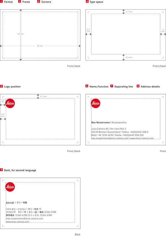

Format
W x H: 85 x 54 mm
Frame
Width: 2.5 mm
Corners
Length: 2 mm, line thickness: 0.2 pt, position: inner frame edges
Type space
Margin: left 6.2 mm, right: 6 mm, bottom: 6.5 mm, top 4.7 mm
Logo
Position: x = 5.5 mm, y = 4.7 mm, size: ⌀10 mm
color: Leica Camera Red (spot color)
Name/function
Position: left-aligned, separated from the address block by a blank line, length: only 1 line whenever possible, if name and/or function are too long, the function is set below the name; font (name): Corporate S BQ medium, font (function): Corporate S BQ light, font size: 7 pt, line spacing: 9.5 pt, tracking: 15, color: black
Separating line
Capital “i,” font: Corporate S BQ light, font size: 7 pt, vertically scaled (125%), baseline shift –0.65 pt, 1 space before and after the line (refer to table and usage in the chapter “Brochures-Typography”)
Address details
Margins: left: 6.2 mm, right: 6 mm, bottPosition: left-aligned, develops upwards from the bottom edge of the type space; Leica Camera AG or Leica Camera subsidiary I Street I City I Country I Phone I Cell phone I Fax I E-mail address I URL. Individual details set on the same line are divided by a separating line. No separating line is set at the end of the line. The order of the details is always the same. It takes account of the local requirements of the respective country. Font: Corporate S BQ light, font size: 7 pt, line spacing: 9.5 pt, tracking: 15, color: blackom: 6.5 mm, top: 6 mm
Second language
The layout of the back of business cards is identical to the layout of the front. The back is used for the second language required.
The examples displayed here show Leica Camera AG stationery;
the descriptions apply equally to stationery for all Leica subsidiaries.
Sub-Logos
Layout of monolingual business cards (85 × 54 mm).
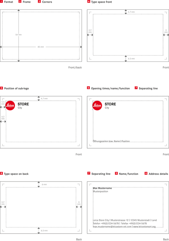

Format
W x H: 85 x 54 mm
Frame
Width: 2.5 mm
Corners
Length: 2 mm, line thickness: 0.2 pt, position: inner frame edges
Type space (front)
Margin: left 6.2 mm, right: 6 mm, bottom: 6.5 mm, top 4.7 mm
Sub-logo
Position: x = 5.5 mm; y = 4.7 mm, Leica logo size: ø 10 mm
color: Leica Camera Red (spot color); files are available for download
Opening times or name/ function (front)
Position: left-aligned, develops upwards from the bottom edge of the type space, length: only 1 line whenever possible, if name and/or function are too long, the function is set below the name; font (name): Corporate S BQ medium, font (function): Corporate S BQ light, font size: 7 pt, line spacing: 9.5 pt, tracking: 15, color: black
Separating line
Capital “i,” font: Corporate S BQ light, font size: 7 pt, vertically scaled (125%), baseline shift –0.65 pt, 1 space before and after the line (refer to table and usage in the chapter “Brochures-Typography”)
Type space (back)
Margins: left: 6.2 mm, right: 6 mm, bottom: 6.5 mm, top: 6 mm
Name/function (back)
Position: left-aligned on the top edge of the type space, name and function set one below the other; font (name): Corporate S BQ medium, font (function): Corporate S BQ light, font size: 7 pt, line spacing: 9.5 pt, tracking: 15, color: black
Address details
Position: left-aligned, develops upwards from the bottom edge of the type space; Leica dummy copy I Street I City I Country I Phone I Cell phone I Fax I E-mail address I URL. Individual details set on the same line are divided by a separating line. No separating line is set at the end of the line. The order of the details is always the same. It takes account of the local requirements of the respective country. Font: Corporate S BQ light, font size: 7 pt, line spacing: 9.5 pt, tracking: 15, color: black
Layout of bilingual business cards (85 × 54 mm).
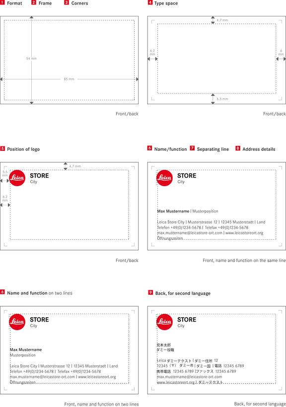

Format
W x H: 85 x 54 mm
Frame
Width: 2.5 mm
Corners
Length: 2 mm, line thickness: 0.2 pt, position: inner frame edges
Type space
Margin: left 6.2 mm, right: 6 mm, bottom: 6.5 mm, top 4.7 mm
Sub-logo
Position: x = 5.5 mm; y = 4.7 mm, Leica logo size: ø 10 mm
color: Leica Camera Red (spot color); .eps files are available for download
Name/function
Position: left-aligned, separated from the address block by a blank line, length: only 1 line whenever possible, if name and/or function are too long, the function is set below the name; font (name): Corporate S BQ medium, font (function): Corporate S BQ light, font size: 7 pt, line spacing: 9.5 pt, tracking: 15, color: black
Separating line
Capital “i,” font: Corporate S BQ light, font size: 7 pt, vertically scaled (125%), baseline shift –0.65 pt, 1 space before and after the line (refer to table and usage in the chapter “Brochures-Typography”)
Address details
Margins: left: 6.2 mm, right: 6 mm, Position: left-aligned, develops upwards from the bottom edge of the type space; Leica dummy copy I Street I City I Country I Phone I Cell phone I Fax I E-mail address I URL. Individual details set on the same line are divided by a separating line. No separating line is set at the end of the line. The order of the details is always the same. It takes account of the local requirements of the respective country. Font: Corporate S BQ light, font size: 7 pt, line spacing: 9.5 pt, tracking: 15, color: black: 6.5 mm, top: 6 mm
Second language
The layout of the back of business cards is identical to the layout of the front. The back is used for the second language required.
The examples displayed here show the version for a Leica Store;
the descriptions apply equally for all sub-logos.