General
Leica Camera is also depicted as a modern, forward-looking company in its use of typography. The consistent use of only one font family, Corporate S, in all communicative channels ensures continuity and immediate recognition – completely in keeping with the uniform look. The typography is reduced to the essentials. It is timeless and elegant, sans serif and precise, simple and matter-of-fact.
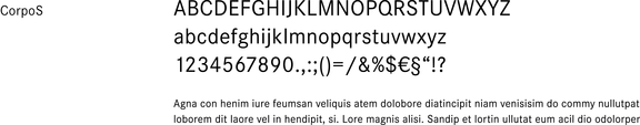
Font
The Corporate S font family was created by Kurt Weidemann in 1990 and is characterized by objectivity and maximized legibility. It is primarily employed in the styles light for copy and subheadings and bold for headlines. Medium style is suitable for highlighting text in copy and tables. Regular style is a substitute for light, e. g. for small type on dark backgrounds.
Typesetting
Generally, all text is set in left-justified rag with hyphenation.
Exception
Calibri may be used as a substitute font for electronic media, or in cases where the corporate font is not available (for technical reasons), such as in the e-mail signature. This must, however, be treated as an exception.
For advertising and marketing


For general communication
The CorpoS typeface is a close equivalent to Corporate S. The CorpoS regular typeface should be used in Word, PowerPoint etc. on digital devices if possible.
CAUTION: In case of open documents being sent out and the recipient has not installed the CorpoS typeface, text will be displayed with a fallback variant.