The Leica look is distinguished by the premium character of its design. Through the use of the following design elements in communicative media, Leica creates immediately recognizable features that simultaneously differentiate the brand from its competitors. The design elements include the frame, the framing corners, and the banderole.
Frame
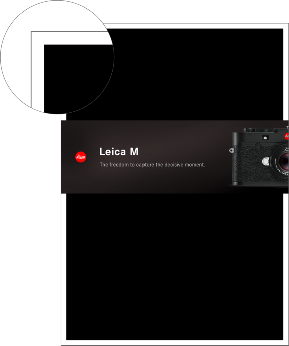
Cover
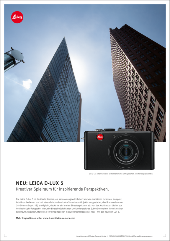
1/1 ad
General
A white frame lends all advertising media a unique character. It hallmarks the modernity and personality of the Leica Camera brand and establishes a distinct differentiation from its competitors.
Colour
The colour of the frame is always white, as white stands for the purity of light and clarity. It lends greater contrast to the layout and images, consequently adding a strong impact to the advertising media.
Frame width
The width of the frame changes in proportion to the respective format. The table below shows the frame widths for all typical DIN formats, rounded to whole numbers. Only in exceptional cases may the frame be employed with a width of less than 3.5 mm.
DIN formats
Frame width
in mm*
Logo size Ø
in mm*
DIN long, 105 × 210 mm
3.5
10
DIN A5, 148 × 210 mm
3.5
10
DIN A4, 210 × 297 mm
5
10**
DIN A3, 297 × 420 mm
7
14
DIN A2, 420 × 594 mm
10
20
DIN A1, 594 × 841 mm
14
28
DIN A0, 841 × 1189 mm
20
40
Info:
For DIN formats larger than DIN A4, the logo size and frame width have a ratio of 2:1. Due
to the specified minimum size of the logo of 10 mm, this ratio is invalid for smaller formats.
* All values are rounded to whole numbers.
** For DIN A4 ads, the logo size is different from the specified value.
Framing Corners
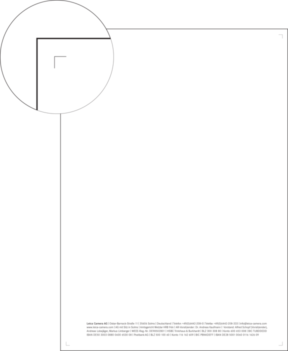

Letterhead
1/1 ad
General
The framing corners set a focus on the page content and create a frame for it. Simultaneously, they carry the characteristic white Leica Camera frame from one page to the next, ensuring its visibility even in cases where it is not established by an adjacent colour-filled space or an image.
Position
The frame corners are located at the inner edges of the white frame. They may be omitted when an image or colour-filled space extends to the frame.
Colour/size
The framing corners are always black. Their length and line thickness is determined by the format and is defined separately for individual advertising media.
Banderole
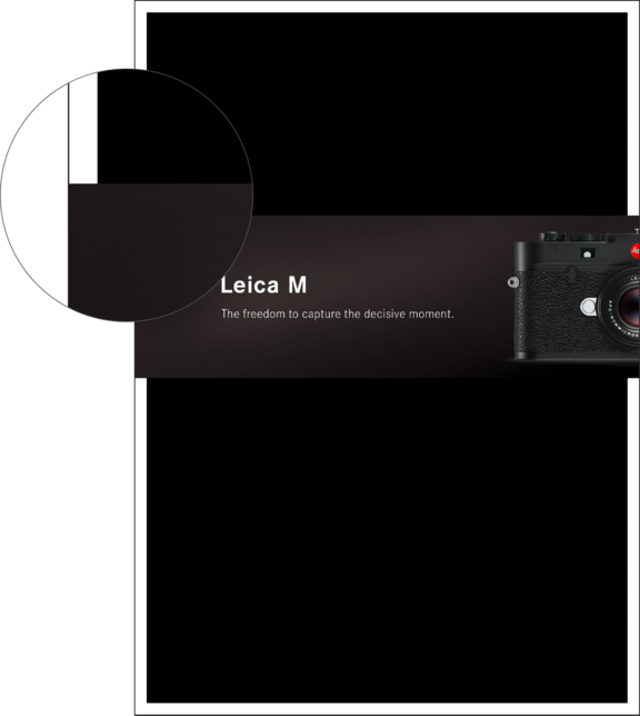
Cover
General
The banderole is a special design feature used for certain advertising media, (e.g. literature: front and back covers). It is the element in which the brand and the content of the advertising medium are communicated in both typographical and photographic form. It runs around the brochure like a ribbon and is the only element that may break through the white frame. Thanks to its superior finish (UV lacquer), it underlines the premium character of the brand.
Position
The banderole always extends across the full format width. Its size and placement is defined separately in the individual chapters.